
The Ten Worst State Flags
published October 6, 2009
If you thought the 10 worst flags of the world were bad, you've got another thing coming. We here in the U.S. only have 50 states, and almost all have horrible flags. They're like a poor man's version of world flags. I originally was going to write about the 5 best and the 5 worst state flags, but I could only find 2 that were slightly good, and about 25 that were horrific. These are the 10 worst of these flags. If you are squeamish, you may want to turn away.
 |
|
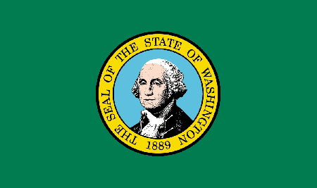
#10 - Washington - I actually think this flag is quite bad ass, just kind of ugly. If you're going to have a portrait of George Washington (get it - the state is called Washington!), you probably should surround him with better and more patriotic colors. Teal, yellow and green?! |
 |
|
#9 - Kansas - Thanks Kansas, way to eliminate all the fun of "Guess the State Flag" game. Then we have that silly latin phrase which means "To the stars through difficulties." Your guess is as good as mine as to what that phrase means. My guess is that it means to get out of Kansas, you'll have to look "somewhere over the rainbow." |
 |
|
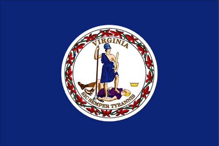
#8 - Virginia - While the rest of the 13 colonies were busy fighting the British with guns, bayonets and cannons, apparently Virginia was using spears, togas, and enormous white dildos. In their defense, it's a reference to Brutus when he slayed Caeser. Correct me if I'm wrong, but wasn't Brutus the asshole and Caeser the good guy? |
 |
|
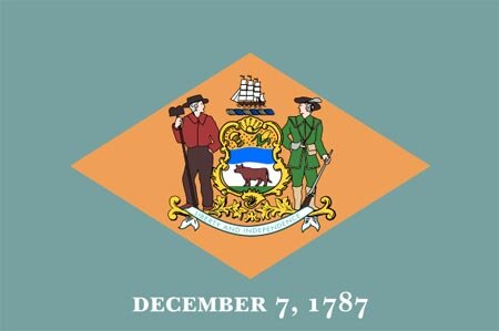
#7 - Delaware - Once you get past the horrible colors, you realize that Delaware is kind enough to post a date on its flag. The middle is some sort of ugly smattering of a couple colonial dudes, a cow, a ship, corn, mysterious vegetable all on a gold diamond. The only thing that would make this flag worse is putting the words "Never Forget" under the date. |
 |
|
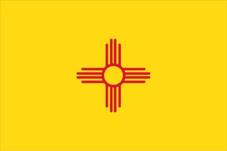
#6 - New Mexico - Aesthetically, this flag doesn't look too bad. That is, until you realize it looks like the crosshairs of a rifle scope. Like the logo for Target megastores, this flag looks like target practice for yokels driving around with guns, or better yet, terrorists. It's like America is telling the haters of our liberty to aim here. |
 |
|
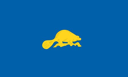
#5 - Oregon (the back side) - No, you are seeing this correctly. The back of the Oregon flag is a euphemism for vagina. That's right, it's a beaver, a yellow beaver. While I admit the beaver is a pretty awesome animal, I'm not sure it should be on the center of a flag, especially a horribly drawn yellow one. |
 |
|
#4 - Rhode Island - If I had a huge mancrush of Barack Obama, and had to show the world, this is what I would get tattooed on my arm. Even the stars form an "O." Another interesting thing is that the word 'Hope" on the flag implies that everything sucks in Rhode Island, but at least you can hope for better. |
 |
|
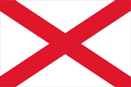
#3 - Alabama - For some reason, the design of the flag makes so much sense. It's like a big red 'X' over the state of Alabama telling people that it probably is not a good idea to go there. When your state flag is the same symbol as a strike on family feud, it's probably not a good thing. In their defense, it replaced the old confederate flag. |
 |
|
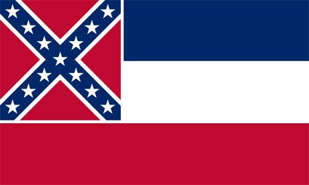
#2 - Mississippi - And you thought the confederate flag was a racist relic of the shameful American past! Mississippi proudly bears this shameful emblem on it's flag, much like a pedophile willingly bears a 'P' singed onto his forehead. In 2001, a much better flag that eliminated the confederate symbol was proposed. It was promptly shut down by a 65%-35% margin, proving that most Mississippi residents really are racists. |
 |
|
#1 - Maryland - The best way to describe my reaction when I first saw this flag was a combination of shock and disgust. It looks like a Nascar flag with down syndrome. Each emblem on its own may look ok, but together it just doesn't work. It's like cross breeding Ripley and the Alien and getting that nasty hybrid that says "Killlll meeeee." |
* * * * *